Thursday, October 1, 2009

A Creative Genius at Work.... Lukas Petrash, Architect

Today's blog post is out of our normal vein, but I couldn't resist. The story is about a good friend of ours, who recently graduated with his Masters Degree from the Harvard School of Architecture - Lukas Petrash.

Lukas is one of the most interesting people I've met in a long time. His passion for building cost-effective, eco-friendly houses that "live lightly" on the land they occupy is amazing - and contagious. I met Lukas last year at a church function, and spent some time talking to him about his work. Lukas is a quiet, unassuming man, and you won't hear him talking just for the sake of hearing himself talk. But bring up architecture or design, and Lukas is off to the races. He becomes animated, energetic, informative - and completely involved in any conversation about his favorite topic.

Shortly after I met Lukas, my husband showed me one of his homes, located in Huntsville, Tx. The house was built of recycled materials, encompasses a footprint of only 484 square feet and cost only $24,500 to build. Lukas, along with friends and family members (one of  whom later moved into the house), provided the labor to build the home. Oh, one point of interest - Lukas was only 23 years old when he completed the project. The Architectural Record recently did a story on Lukas' MCD House. Take a minute to read that story - it's worth your time.

Here's what we love about the house: There was a great tree on the lot where the home was to be built. Lukas kept the tree  and built a deck around it.


3 years later, that tree is growing beautifully, and the deck can be used year round, even in Texas, because it's shaded in the summer. Not only that, but the tree is on the West side of the house, and protects the house from the sun during the hottest part of the day.

 Those of you who live in the South understand what a wonderful gift this is. Those of you who don't live in the South - just take my word for it.


The bathroom is located in a corner of the house - with the shower/bath surround placed at the juncture of the two outside walls.  In addition to adding a high multi-paned window that allows sunlight into the shower stall, Lukas used translucent tiles on the two outside walls that allow more natural light to enter the room, without losing any privacy. I love this space.


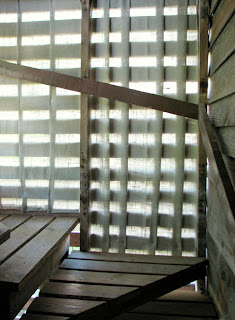
To make the most of the space, while minimizing the land usage of the house, Lukas created a loft space above the first floor, with an exterior "breathing" staircase. The staircase, located on another corner of the structure, was made with shipping pallets, and lined with fabric to afford the space better air circulation and more natural light.

In the photo above, you can see the exterior of the staircase on the left corner of the house - also conveniently located under that shade tree!


 This is a small house, but Lukas managed to create extra space by including built-in niches and shelves, and building the windows out from the walls.


Our oldest daughter is out on her own, working as a chef. She's currently renting a house. She told me that when she's to ready to own her own home, she wants Lukas to build it for her. Now our oldest son wants one as well.

Considering that we have 6 children, and four of them are teenagers, we could conceivably keep Lukas busy for some time, just building homes for our offspring. However, I have a sneaking suspicion that Lukas is going to remain booked up for some time, and our children will have to get in line. Part II of this blog will explain why....


Thursday, September 17, 2009

Interior Identity: Bubbly (Designing a Guest Bath)

In this post, we'll be putting together an eclectic guest bath, worthy of the description "Bubbly". The word bubbly is defined as "pertaining to bubbles; lively; effervescent; full of high spirits. When we think of bubbles, we think circles (and water), and we'll be using the circular shape throughout the design, along with a free-spirited bent in the decor, and colors that make us think "water" or beach.

First, the shower tile - Interior Identity: Bubbly by MosaicTileSupplies.com:


We've decided that this guest bath has a tub/shower combination, so we picked out this CUTE Ice Circles Shower Curtain at BedBathBeyond.com:


Now, for a vanity-- this one is a bit of a DIY project, but we couldn't resist. We found this article on the DIY Network about repurposing antique & vintage furniture for the bathroom, which inspired us to pair a vessel sink with an antique dresser.
We found the DeNovo Bergles Glass Vessel Sink at Overstock.com:

This vintage dresser is thanks to the Life In The Fun Lane Blog, as is the inspiration for using driftwood as a functional decor item, which we will discuss shortly.


This dresser is a great size for a single vessel sink, because it leaves room on either corner to hold a few fun but functional decor pieces (not to mention the storage space underneath). On one side, try a small grouping of bottles & jars (mix new with vintage pieces) to store cotton balls, small soaps, bath salts or oils and lotions. Just use a cork for any bottles that don't have their own lids. The apothecary jar set (with the luscious etched pattern) is from Graham and Green. The others were found on eBay, for $15 or less.
Use the other side of the vanity counter for hand towels, and this gorgeous Alabaster Inlay box, perfect for a bar of handmade soap. The alabaster box was also found at Graham and Green:


Above the vanity, we picked a 20" round hanging mirror with a ball chain that we think works with the quirky bits in this bathroom. We found this one at AllModern.com - the Babbette Moderne Mirror:

Next, the floor. We like the charcoal color in the frosted glass tile, but we wanted something a little more unique for the floor, so we chose the Lyric Unglazed Penny Round Mosaic Tile in Charcoal from MosaicTileSupplies.com:


For the walls, we decided to go with Beadboard panels (from Beadboard.com) 2/3 of the way up the wall, and a beautiful blue paint (MPC Match for HulsJaybird) from MyPerfectColor.com:


For a few finishing touches, we chose a fun print we found at Nimli.com - The Doan Gilman Weathervane print - the driftwood (repurposed as a towel rack) that we referred to earlier, found at Completely-Coastal.com, and a round microfiber bath rug in Aloe Green, at BedBathStore.com:


That's all for now. We'll be back soon with our next Interior Identity virtual room makeover.

In the meantime, Keep Coloring on the Walls....

Haleigh & all of the gang at
MosaicTileSupplies.com

Blog Party at HomeDigz - Visit these great blogs!


Wednesday, September 16, 2009

Interior Identity: Ambitious (Kitchen Design)

The word "ambitious" brings to mind the type A personality- individuals with focus, drive and a strong desire for the all of the best things in life. This kitchen mock-up will be comprised of products and design that reflect high performance, function and quality in order to create a design worthy of its "Interior Identity".

First, let's look at the glass tile blend we've chosen for the backsplash: Interior Identity: Ambitious, from MosaicTileSupplies.com


Next, the countertops. We looked for high performance,function and modern appeal as well as color & texture.

Our material choice? Recycled Glass. Why? Recycled Glass Countertops are durable, sustainable, heat resistant, and available in a myriad of colors and color blends. Price-wise, recycled glass countertops are in the same range as Corian or granite, with the added benefit of being an eco-friendly choice. For this kitchen, we chose IceStone in Gelato, because the color works beautifully with our backsplash tile, and we wanted a light surface to contrast our cabinet choice.


Speaking of cabinets, we found the perfect door style and color at HicksDistributors.com, from HomeCrest Cabinets' Heritage Collection in Java Linen. We love the cream (Linen) piping against the black base color, which makes the detail of the cabinet doors stand out, as well as working well with the other colors in our (virtual) kitchen design.


Moving on, we decided to use a light-toned flooring to keep this room from being too dark. After all, since we're doing this without a final destination in mind, we don't know how much natural light the room will have, and too much black can overwhelm a space without sufficient light in it. We like the earthiness of the palette in this room, and decided to go with a floor that would have the same feel. Wood flooring is always a great choice, but we decided to have a little fun, and chose a wood grained rectified porcelain tile flooring in a 6 X 24" size, with an offset joint - Torino Natural Driftwood, available at BuildDirect.com. It has a great wood grain, and beautiful natural color, but offers the higher performance, easy clean-up and low porosity benefits of porcelain tile.

Now, there's only one major surface left in this project - the walls - and dependent on the architectural design of the kitchen, precious little area may be left uncovered by cabinetry and windows. However, no design is complete without discussing the wall color. We found two choices that would work beautifully in this layout, and we're including them both here so that you can let us know which you prefer. Both Choices are from the Valspar Ultra Premium Line.

The first, for those of you who prefer to remain in the neutral palette for wall color, is December Starlight:


The second is for those of you who love to "color on the walls". Stillness is the perfect shade to add a little more color to this room, without being overwhelming:


That's all for this post. We look forward to hearing what you think about this room's color & product choices, and to the next virtual design, coming soon.

In the meantime....
Keep coloring on the walls,
Haleigh
MosaicTileSupplies.com

Creating a Home with Personal Style

Many of us realize that our home's personality reflects our own, and we take that into account when designing & decorating a new space. Taking that into account, Mosaic Tile Supplies created a series of glass tile blends called the Interior Identities Collection, and each blend was named for a personality trait. We'll be using these blends as well as other products we find online for the starting point in creating each room, and will attempt to create a complete design for each room that "fits" with its interior identity.

This blog will focus mainly on the projects and products that will offer inspiration & assistance in creating rooms that reflect your own personal taste and design style.

We hope that you enjoy the series, and welcome your thoughts, input, feedback and suggestions as we go.

Keep Coloring on the Walls,
Haleigh
MosaicTileSupplies.com